
Report automation and Data visualization in MS Excel
Prepare professionally looking reports in a few seconds and few clicks. Create powerpoint and PDF reports efortlessly directly in MS Excel.
Prepare your professionally looking data presentations in a few seconds by creating a wide array of MS Excel non-native charts and combining them into attractive data presentations easily. Are you a MS Excel rookie? No problem, create your reports just with basic skills. No advanced-user experience, no how-to-do learning. Regardless of their complexity, in Vissto all charts and reports are made with a few clicks of your mouse.
You can choose to purchase a license or to use our "Vissto Lite" free of charge version.
All charts are created in three easy steps
In Vissto all designs follow data visualization theory, hence data types and chart types are always matched. No matter if chart represents a timeline, compares parts of the whole or items. Vissto knows them all and guides you through the whole process. A few clicks of the mouse and job is done. So simple, so easy, so fast.
Data type selection
In the first step the data type is selected. A pop up ribbon menu offers all basic data types – timelines, discrete items, parts of the whole, correlations, histograms and story-telling charts. Once an icon with appropriate data type is clicked, only related chart types are shown.
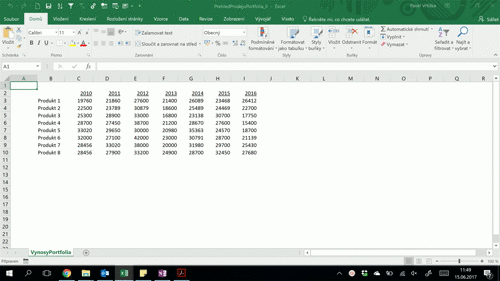
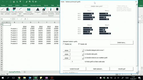
Chart creation
After choosing a chart type the chart creation form appears. Three to four different cell ranges in a chart sheet must be highlighted to be filled in the chart fields automatically. Contrary to the Excel, there is no need to prepare one structured data table in advance. Cell ranges from different and independent tables (even from different sheets) can be highlighted to fill in one chart form. Once the job is done, click the “Create Chart” button to create the chart.
Fine-tune the design
After the chart is created you can choose from different options to fine-tune the graphical design:
- In-chart graphical data analysis
- Fast and easy design adjustment oprions
- Options to restructure the chart easily
Let's see how the charts can improve with Vissto (drag the line in the middle of the chart)
Bullet chart
Do you like a kind of spaghetti charts Excel sometimes produces for you? We do not. That’s why Vissto uses Bullet charts instead. They eliminate need to compare individual colours with chart’s legend repeatedly to re-identify colour association with chart’s lines.
Bullet charts feature a single quantitative measure (for example, year-to-date revenue) and relate the featured measure to defined quantitative ranges that declare its qualitative state (for example, good, satisfactory, and poor) to enrich the meaning of the featured measure. In addition, bullet charts provide the comparison of the featured measure to one related measure (for example, the planned target or the same measure at some point in the past, such as a year ago). Its linear design supports more efficient reading. Vissto enables creation of column and bar bullet charts.
Cash Flow Chart
Easy-to-read cashflow visualizations are welcomed by all (not only financial) executives. Cashflow chart is a performance chart that uses a simple data table comparing values for different periods. With just a few clicks you can create time series showing P/L comparisons combined with cumulative cashflow projections.
In most cases, cashflow chart is used for visual display of financial results but is also convenient for displaying of the flow of the stock in the warehouse, etc.
Butterfly Chart
Butterfly charts serve the purpose of displaying two nominal categories one next to the other (for example, the gender bar chart). If you need to compare trends of individual items in both categories, the butterfly chart is the solution.
Butterfly charts enable to compare parts of both categories at the first glance. In practice, butterfly charts are being used to visualize quantitative data not only in business but especially for socio-demographic analyses (age composition by genders) etc. Vissto enables creation of column and bar charts and it also enables to dynamically reposition chart labels from the middle of the chart to it’s right/left side.
Deviance Chart
To enable effective visual display and comparison of individual deviations from referenced value, it is necessary to recalculate them, for example, as percentage deviations from the planned values. Only such projections enable visual comparison in context to the planned values.
In Vissto no recalculation is needed. Vissto does it all for you and moreover, you will be able to switch between absolute and relative deviations just with one click.
Ebit Chart
When comparison of two different datasets displays balance between two measures, classic column chart is not an appropriate solution. You can see the balance but comparing differences visually is not an easy task. Vissto’s Balance chart will do this for you. Balance chart displays two measures and their balance in one chart.
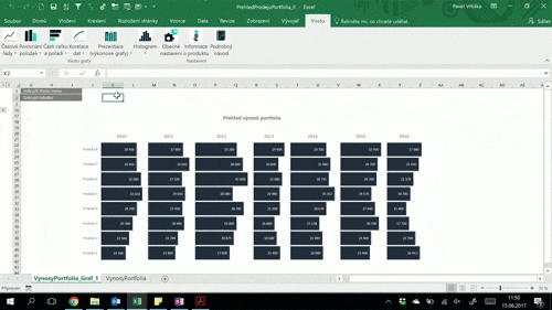
Group Chart
Reveal trends in time series line charts. Do you need to compare trends of several categories that create clutter when displayed in a simple multi categorical line chart? Or the chart is cluttered to effectively obscure detailed trends for individual sub/categories?
Clustered grouped chart is a solution for situations where displaying of more categories to compare all of them is required. You can compare yourself how much easier is to visually compare displayed trends between excel-produced charts and the ones delivered by Vissto. In Vissto you can create them all – line and column/bar charts with data displayed horizontally or vertically.
Histogram
You can create histograms in the latest version of Excel 2016 but with very limited functionalities. If you need to set intervals of distribution or you want to display statistical characteristics of the data set, Excel will not help you. In Vissto there are numerous adjustments at your disposal. You can set the groups of categories to distribute, value intervals and to select required statistical characteristics to be displayed.
Pareto Chart
Avoid Pie(Donut) Charts. Pie Charts do not work well when used to graphically display “part of the whole” type of quantitative data. Use Pareto Charts instead. Pareto charts combine a classic column charts with a line chart where the line displays cumulative sum of the values represented by columns. These charts are used for visualizing those situations when the message should illustrate how individual items of the whole contribute to its total value.
A common example is the situation when the whole contains a lot of items, but only a small part of the whole has a share of its total value or volume. e.g. A corporation exports to 20 countries but 80% of the goods exported were directed to only 5 countries.
Ranked Items Chart
Would you like to point out which products contributed the most and which ones the least? Or do you need to visualize clearly which branches are profitable and which ones are not? Use Ranked items charts that display ordered categories according to their values (or according to other criteria).
Only one data set is used the elements of which have negative can have and/or positive values. The chart will automatically order the data from the smallest to the largest, negative numbers are displayed on the left and positive on the right.
Small Multiples
A series of similar graphs or charts using the same scale + axes, allowing them to be easily compared. Matrix sets of small charts (Small Multiples) charts can use a variable number of graphs arranged into various matrices where the limit is only the clarity and comprehensibility of such presentation. Trello charts enable a very meaningful and effective way of presenting data for mutual comparison of the characteristics of one or more categories at once. These sets are an effective solution wherever two axes in a standard chart do not suffice.
Small Multiples 2
Displaying numerous categories over several years while not losing clarity in storytelling may be a tricky goal. Small multiples (Trello chart) do this for you. Arranging and rearranging charts in matrix in whatever manner is a matter of seconds. Communicating information in an intended manner is easy and straightforward.
When comparing year on year sales of several articles, arranging them on the Y axis of the charts will do the task. Comparing sales of the individual article over several years? Swap the charts’ axis and you will see what you need. Easy and frictionless.
Clustered grouped charts
You have a set of data divided into numerous subcategories and your aim is to show them all in one chart. Excel will not work you in this case but Vissto will do. Try its clustered grouped chart option.
The chart will enable you to compare cost and revenues in various corporate divisions. The main categories in each division can be divided into several subcategories that do not have to display all parts of the whole. You can select which subcategories will be shown that will enable you to point out 2-3 selected subcategories. Vissto enables creation of bar and column charts.
Thermometer Chart
Are you comparing generated profits over time against their planned values in a standard column chart and what you are getting is a visual mess?
You should use a Thermometer chart that overlaps two columns to visually compare two individual values in an efficient manner. Comparing gaps between both categories is easy while we simultaneously clearly see each category as an individual trend.
ooo
With Vissto you will recieve a unique set of possibilities and functions
All work is performed within a MS Excel environment
Contrary to other data visualization programs, Vissto is fully integrated into the MS Excel. Vissto charts can be adjusted and formatted directly in Excel as its native charts.
Visually attractive and story-telling charts in a few seconds
All charts can be created with a few mouse clicks without any previous Excel working experience with charts.
Professionally looking chart designs with no need for further adjustments
Vissto takes care of all visualization rules for you – design of created charts requires no following corrections.
Full interactivity with source data
Updating all numbers in their source tables is possible in all times. Contrary to the Excel, re-positioning of rows and columns in the source table switch the data within the chart as well. Isn't it cool to have an interactive chart?
All calculations and data restructuring are performed automatically
Some charts require certain recalculations of values and intended re-positioning of table rows and columns and values to present visualizations correctly. Vissto does all needed adjustments automatically. A huge amount of time is typically sparred by performed automation.
In-chart graphical data analyses
After the chart has been created menu for highlighting different chart values is made available to make desired analysis. Highlighting is possible according to different options and parameters such as the highest and the lowest values, comparison to a referenced value. Highlighting of values according to some statistical characteristics (percentiles, median, averages, etc.) is also available.
Carefully selected color combinations
Vissto color profiles are impaired color vision (color blindness) compliant.
Easy-to-perform chart exporting function
Exporting of created charts to JPEG, PNG and GIF formats as well as saving the charts as Excel objects in the computer’s memory is available.
Wallet-friendly price
Vissto is priced reasonably enough to be affordable almost for everyone.
Let's see Vissto in action
Save your time and effort
We say STOP to all that clicking
Professionally looking charts fast & easy
Try Vissto for 30 days for free. Afterwards you can decide to purchase the license or to continue for free with limited functionality.
Download Vissto
First of all, download your copy of Vissto at no price right away and you can try all its features for free during the next 30 days.
Afterwards you will be required to purchase your license to continue using a fully functional copy of your software or you can decide to use Vissto with certain limitations in its functionality for free forever by switching to “Vissto – Lite” version.
Download Vissto
Purchase license
Take advantage of our introductory price and purchase your license just from 2,5 EUR per month! We offer different licence types:
- Monthly licence: 10 EUR monthly (payable in one installment of 10 EUR).
- Half-year licence: 3,33 EUR monthly (payable in one installment of 20 EUR).
- Annual licence: 2,5 EUR monthly(payable in one installment of 30 EUR).
And instead your time wasted with your computer you can start creating professionally designed and visually appealing charts in a few seconds with a few clicks of a mouse.
Purchase licenseYou will recieve the confirmation email with download link right after you send this form. If you do not see the email in your inbox, please check your junk folder (SPAM).